Brand
ONA, ready for production.
Logos, colours and typefaces for suppliers, printers and partners. Take what you need.
Vector files open in Illustrator, Affinity, Inkscape and Figma.
01 — Logo
One mark, five colours.
Pick the colour first. Every preview and download below follows it.
Wordmark
The default mark: web, cards, labels, dust bag, box.
Min. 64 px / 18 mm wide
Download
Download
Download
Download
Download
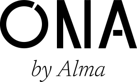
Signature
ONA with “by Alma”, for provenance: product card, woven label, packaging insert.
Min. 120 px / 25 mm wide
Download
Download
Download
Download
Download
Stacked lockup
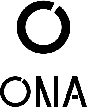
Symbol above wordmark, for square formats, inserts and stickers.
Min. 40 px / 12 mm (wordmark width)
Download
Download
Download
Download
Download
Symbol
The open O: hardware, hang tag, stamp, deboss, avatars.
48 px / 8 mm and larger
Download
Download
Download
Download
Download
Small symbol
Optically corrected, so the opening stays visible at small sizes.
16–48 px · 6–8 mm
Download
Download
Download
Download
Download




































































App icon and avatars






















On light, dark and colour
Use the file that matches the ground. Never place the logo on a busy part of a photograph.
Espresso on Ivory
Espresso on Bone
Espresso on Stone
Ivory on Espresso
Ivory on Ink
Ivory on Burgundy
Gold on Espresso · the signature pairing
Black on white material
Clear space
Keep a margin of x on every side: half the height of the wordmark. For the symbol, x is a quarter of its diameter. Align the logo left in layouts; centre it only on centred objects.
02 — Colour
The bag brings the colour.
The brand builds the frame. Neutrals do 90 % of the work, Espresso is the brand dark, gold and burgundy are rare.
Core
- Default background
ONA Ivory
- RGB
- 243 238 228
- CMYK
- 0 2 7 4
- Logo, dark grounds, box
ONA Espresso
- RGB
- 58 43 34
- CMYK
- 45 65 75 65
- Pantone
- ≈ 4625 C
- Body text, buttons
Ink
- RGB
- 28 26 24
- CMYK
- 60 60 60 85
- Symbol on dark, stand-in for foil
ONA Gold
- RGB
- 200 174 118
- CMYK
- 20 28 60 5
- Pantone
- ≈ 871 C
- Accent — at most one per view
ONA Burgundy
- RGB
- 94 31 30
- CMYK
- 25 90 80 55
- Pantone
- ≈ 504 C
Neutrals
- Cards, raised paper
Paper
- RGB
- 248 245 239
- CMYK
- 0 1 4 2
- Muted surfaces, dust bag
Bone
- RGB
- 230 221 205
- CMYK
- 2 5 13 6
- Hairlines
Linen
- RGB
- 217 209 195
- CMYK
- 4 7 15 10
- Strong borders, text on dark
Stone
- RGB
- 201 191 174
- CMYK
- 5 8 18 18
- Decorative only, never text
Taupe
- RGB
- 142 133 122
- CMYK
- 30 32 40 25
- Secondary text
Umber
- RGB
- 110 102 92
- CMYK
- 45 45 52 40
Digital gold is not metal. #C8AE76 stands in for champagne brass on screen. In production, gold is always a real finish: brushed champagne brass or matte champagne foil. Never printed in CMYK, never shiny yellow foil.
CMYK values are starting points for coated stock, not measured conversions — always proof physically. Pantone references are approximate; confirm them with a swatch book.
03 — Type
Serif for voice, sans for information.
Three open-source families under the SIL Open Font License, free for any use.
Newsreader
Headlines, quotes, “by Alma”
Light 300 · Light Italic 300
Each piece begins in Alma’s hands.
Hanken Grotesk
Body text, interface, product details, model names
Regular 400 · Medium 500
Women’s bags, made by hand. Small series — often one of one.
IBM Plex Mono
Labels, specs, numbers — never sentences
Regular 400
MODEL · PIECE · 01
- Headlines are Newsreader Light, never bold.
- Model names: Hanken Grotesk 500, capitals, tracking 0.12 em.
- No script or handwritten fonts, ever.
- Never type ONA in a font in place of the logo.
04 — Dos and don’ts
Quiet, precise, one colour.
DoKeep it small, aligned left, with space around it.
DoGold symbol on Espresso — the signature pairing.
DoOne flat colour on a calm ground.
DoCentre it only on centred objects: box lid, dust bag, stamp.
Don’tStretch or squash it.
Don’tRotate it. The cut in the O stays at one o’clock.
Don’tPut gold on a light ground.
Don’tAdd shadows, outlines or gradients.
Don’tRetype ONA in a font.
Don’tPlace it large on a busy pattern or photograph.
Don’tSet the symbol beside the wordmark.
Don’tEnclose the symbol in a circle or put letters in it.
Contact
Need another format?
Write to us and we’ll send it.
These files are for work made for the ONA brand.